

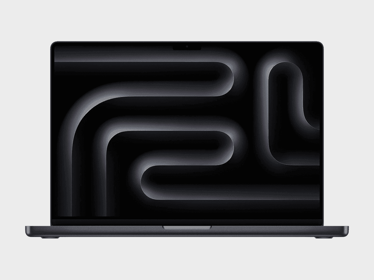
Apple MacBook Pro 14" M5 Simulator & Emulator — Viewport, Resolution & CSS Specs
Test your website on Apple MacBook Pro 14" M5 in one click — no real device required.
- Free
- 30,000+ users
Apple MacBook Pro 14" M5 is a popular device to simulate and emulate among web developers and designers for testing responsive layouts and mobile UI behavior. Year of release: 2025.
Why Test on Apple MacBook Pro 14" M5?
Viewport
14.2-inch 3024×1964 Liquid Retina XDR, ProMotion 120 Hz — high-density pro viewport that tests rendering at high refresh rates.
Pixel Density (DPR)
Standard pixel density reveals blurry images and icon scaling issues on screen.
Performance & Animations
M5 extreme CPU/GPU performance makes scripting and rendering inefficiencies stand out immediately.
Viewport Size (CSS Resolution)
The CSS viewport defines how media queries, layout breakpoints, and responsive components behave.
For Apple MacBook Pro 14" M5, the CSS viewport measures:
- Width: 1440 px
- Height: 900 px
ℹ️ The visible height can vary slightly depending on the browser UI (Safari, Chrome, etc.).
Some analytics platforms only display the physical screen resolution (see below) instead of the CSS viewport size.
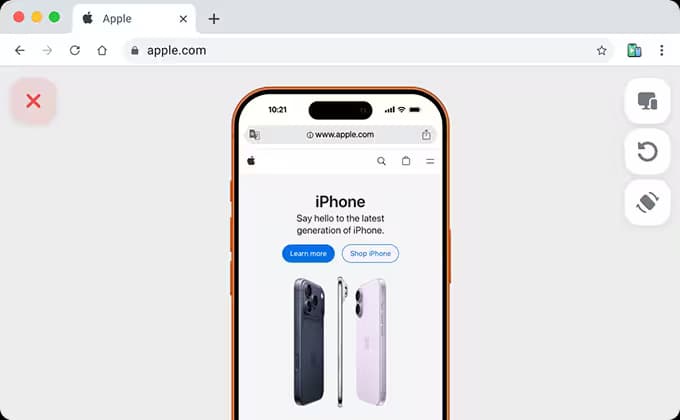
To see exactly how this viewport behaves in real conditions, you can simulate Apple MacBook Pro 14" M5 directly in your browser using Phone Simulator.
Free Apple MacBook Pro 14" M5 Simulator & Emulator
Accurate viewport simulation directly in your browser.
- No account required
- 40+ devices included
- Works offline
- Free
- 30,000+ users
Pixel Density (Device Pixel Ratio)
Apple MacBook Pro 14" M5 has a device pixel ratio of 2.
Each CSS pixel is rendered using 2 physical pixels, resulting in sharper text and images.
For CSS targeting:
@media only screen and (-webkit-min-device-pixel-ratio: 2) {
	/* High-DPI specific styles */
}
In JavaScript:
window.devicePixelRatio;
// returns: 2
Physical Screen Resolution
Physical resolution refers to the actual number of hardware pixels on the display. While it does not affect CSS layouts, it is commonly shown in analytics and device specifications.
- Width: 3024 px
- Height: 1964 px
ℹ️ Physical resolution is not used for CSS layouts but is often shown in analytics tools.
Frequently Asked Questions
What is the viewport size of Apple MacBook Pro 14" M5?
Apple MacBook Pro 14" M5 has a viewport size of 1440×900 CSS pixels.
How can I test my website on Apple MacBook Pro 14" M5?
You can simulate it instantly using the Phone Simulator Chrome extension - no real device required.
How is Phone Simulator better than Chrome DevTools for Apple MacBook Pro 14" M5?
DevTools shows an approximate viewport size, but does not emulate the real mobile browser. Phone Simulator uses exact device characteristics and shows how your site renders in a real mobile browser environment.
Can I test localhost with Phone Simulator on Apple MacBook Pro 14" M5?
Yes. Phone Simulator works with any local URL, including localhost:3000, 127.0.0.1, and similar development setups.
Do I need to buy a Apple MacBook Pro 14" M5 for testing?
No. Phone Simulator provides accurate device simulation for $0 instead of spending $1599+ on a physical device.
More Devices for Mobile Testing
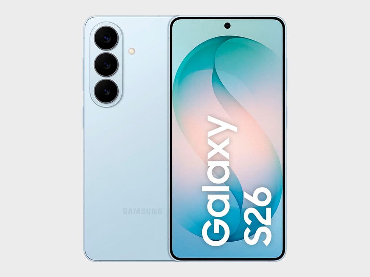
Samsung Galaxy S26
✅ Ready to Simulate in Extension
6.3-inch smartphone released in 2026, featuring 360x773px viewport resolution, 3x pixel density display
See full specifications
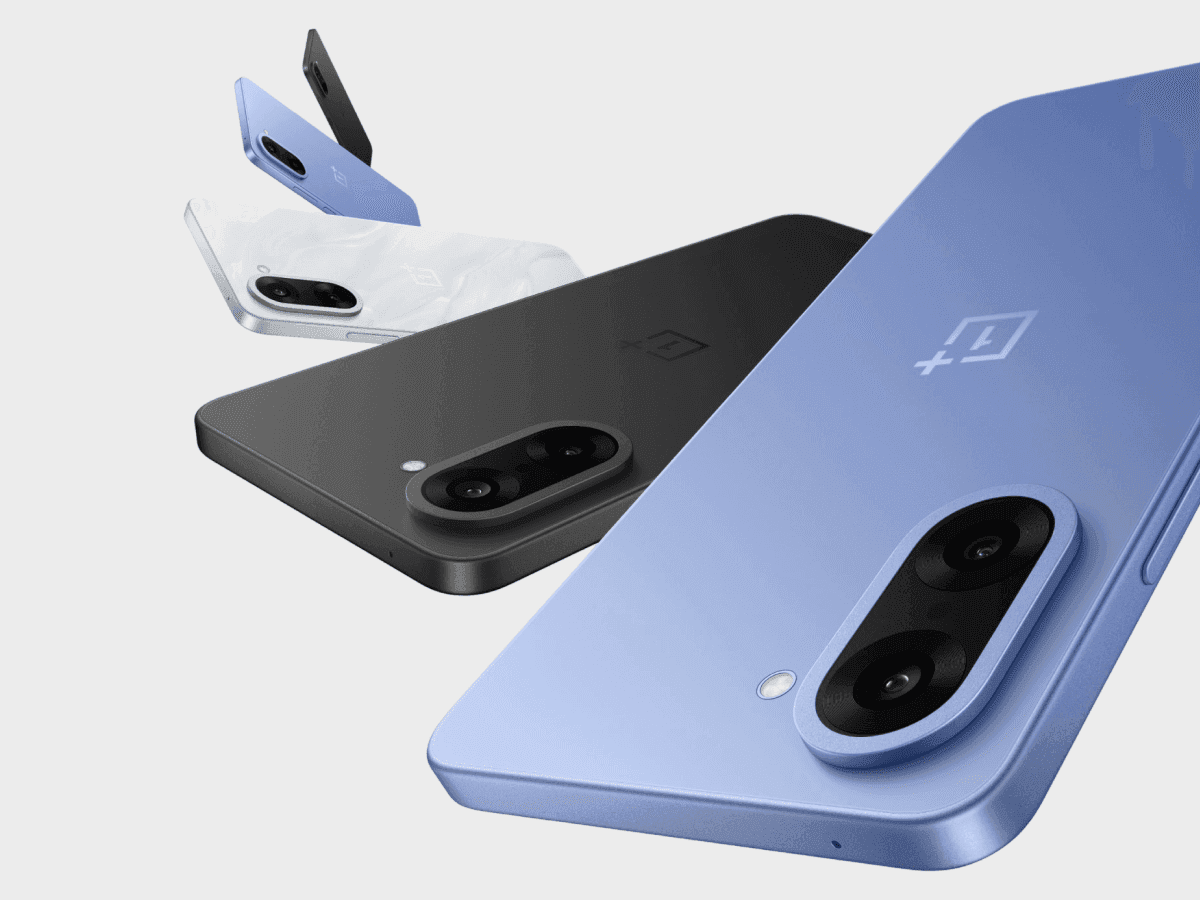
OnePlus Nord CE5
✅ Ready to Simulate in Extension
6.77-inch smartphone released in 2025, featuring 360x797px viewport resolution, 3x pixel density display
See full specifications

Infinix Hot 50 Pro
✅ Ready to Simulate in Extension
6.78-inch smartphone released in 2024, featuring 360x812px viewport resolution, 3x pixel density display
See full specifications