Phone Simulator – Chrome Extension for Mobile & Responsive Testing
Instantly preview any website on real phone sizes.
Catch layout bugs before your users do.
- Free
- 8,000+ users
How to Use Simulator?
Install the Chrome extension
Open any website
Preview on real devices
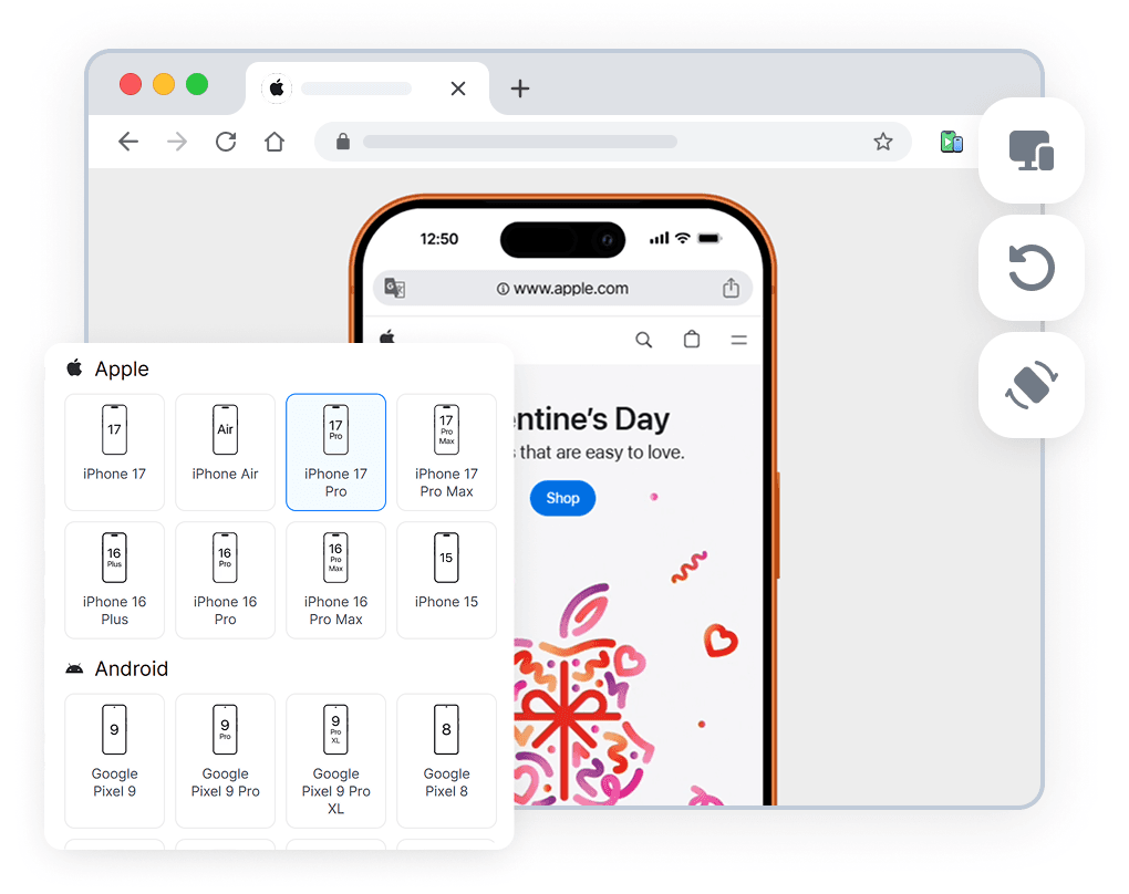
What is Phone Simulator?
Phone Simulator is a Chrome extension that lets you preview and test responsive websites on real mobile device sizes directly in your browser. It emulates popular smartphones and tablets, allowing you to see how your website looks on iPhone, Android phones, iPads, and other devices without using physical hardware or external tools.
The extension is designed for responsive web design testing and mobile-first development. You can switch between device presets instantly, rotate screens between portrait and landscape modes, and work with accurate viewport dimensions and pixel ratios. Phone Simulator works on any website, including local development environments and modern frameworks such as React, Vue, and Angular.
Phone Simulator helps developers, designers, and QA teams catch layout and usability issues early in the development process. By testing mobile layouts directly in Chrome, you can validate breakpoints, media queries, and overall mobile user experience faster — making responsive testing simpler, more efficient, and accessible from a single browser extension.
Key Features
Mobile Device Emulator (30+ Presets)
Test websites on popular smartphones and tablets using real device sizes.
Real Viewport Sizes and Pixel Ratios (DPR)
Validate responsive layouts with correct viewport dimensions and pixel ratios.
One-Click Screen Rotation
Switch between portrait and landscape modes instantly.
OS-Based Browser UI
See websites in a browser interface adapted to the selected operating system.
Realistic Device Frames
Preview websites inside realistic phone and tablet frames.
Works on Any Website
Test live sites, staging environments, and localhost projects.
Modern Framework Friendly
Fully compatible with React, Vue, Angular, and other frameworks.
Instant Device Switching
Compare layouts across multiple devices with a single click.
Why Not Just Use Chrome DevTools?
Chrome DevTools is excellent for debugging, but it focuses on technical inspection rather than realistic mobile previews. Phone Simulator complements DevTools by offering visual, device-focused testing with real device frames, accurate viewports, and instant orientation switching — without manual resizing or setup.
Phone Simulator
- Real device frames
- One-click screen rotation
- OS-based browser UI
- Non-technical friendly
Chrome DevTools
- Abstract viewport
- Manual resizing
- No visual context
- Developer-only tool
Who Uses Phone Simulator?
Frontend Developers
Test responsive layouts, breakpoints, DPR and catch mobile bugs before release
UI/UX Designers
Preview designs in real phone frames and validate spacing, typography, and proportions
QA Engineers
Quickly verify mobile UI issues without switching devices or environments
Agencies & Freelancers
Show clients how websites look on real devices - no screen sharing chaos
Real User Reviews
Rated 4.8 in the Chrome Web Store

Gepardi A.

So far, this one has been better than the other ones I have tried.

Rodolfo M.
Funciona perfeitamente!

Reynaldo D.
I’m very productive with this tools!
Popular Devices Available for Testing
Test responsive websites on the most commonly used smartphones.

Apple iPhone 17 Pro
✅ Ready to Simulate in Extension
6.3-inch smartphone released in 2025, featuring 402x874px viewport resolution, 3x pixel density display
See full specifications

Apple iPhone 16 Pro Max
✅ Ready to Simulate in Extension
6.9-inch smartphone released in 2024, featuring 440x956px viewport resolution, 3x pixel density display
See full specifications

Samsung Galaxy S25
✅ Ready to Simulate in Extension
6.2-inch smartphone released in 2025, featuring 360x780px viewport resolution, 3x pixel density display
See full specifications

Samsung Galaxy S25 Ultra
✅ Ready to Simulate in Extension
6.9-inch smartphone released in 2025, featuring 480x1040px viewport resolution, 3x pixel density display
See full specifications
Mobile Testing Guides
Practical guides and tutorials on mobile testing, responsive design, and real-device previews. Learn how to test websites efficiently across different screen sizes and devices.

Why Your Website Should Load in Under 2 Seconds on Mobile - Backed by 2025–2026 Data
This guide explains why 2 seconds became the standard, what current data tells us about mobile performance, and how to hit that target consistently across devices and networks.
Read more

Why Website Must Look Perfect on the Galaxy Fold - And How to Achieve It
This article explains why foldable optimization matters and how you can ensure your website looks flawless on devices like the Samsung Galaxy Z Fold 6, Samsung Galaxy Z Flip 6, Google Pixel Fold 2, and upcoming hybrid "FlexScreen" devices expected to launch later in 2026.
Read more

Why Android and iOS Render Websites Differently - And How to Design for Both
Android and iOS render websites differently due to fundamental differences in their browser engines, default settings, and system-level behaviors. Understanding these differences is crucial for creating websites that work seamlessly across all devices.
Read more
Install Phone Simulator Today
Join thousands of developers and designers who test their sites on real devices for free.
- Free
- 8,000+ users
Frequently Asked Questions
Is Phone Simulator free to use?
Yes. Phone Simulator is a free Chrome extension available in the Chrome Web Store. You can install and use it without registration or subscription.
Is Phone Simulator a real mobile emulator?
Phone Simulator emulates real device viewports, screen sizes, and pixel ratios. While it does not fully replace physical device testing, it is ideal for responsive layout and UI testing directly in the browser.
How is Phone Simulator different from Chrome DevTools?
Chrome DevTools focuses on debugging and inspection. Phone Simulator provides realistic, visual mobile previews with real device frames, OS-based browser UI, and instant device switching.
Can I test localhost and staging websites?
Yes. Phone Simulator works with any website, including localhost, staging environments, and live production sites.
Which devices are supported?
Phone Simulator supports 30+ popular smartphones and tablets, including iPhone, Samsung Galaxy, Google Pixel, and iPad models.
Does Phone Simulator work with React, Vue, or Angular?
Yes. The extension works with all modern web frameworks and CMS platforms, including React, Vue, Angular, and static websites.
Is Phone Simulator safe to use?
Yes. Phone Simulator does not collect personal data and works entirely within your browser environment.